Interview by ELISABETTA PORCINAI — Artworks by STANLEY DONWOOD
Dry, concise, paratactical and slightly haunted – all pervaded by a good dose of sharp sarcasm. This is Stanley Donwood, mostly known as the signature brushstroke behind all Radiohead’s album artwork since 1994, but not only. His artistic production spans indeed painting, drawing, engraving and writing, and touches upon a variety of themes, among which an all-pervading feeling of alienation and impotence with regard to the human condition. Starting from his tales and nightmarish diaries, we gradually ventured into Stanley’s labyrinth. Here is what we found out.
ELISABETTA P. — I’d like to start by saying that I found your writings both challenging and ravishing: for a moment I was plunged into your stream of consciousness, your daily anxieties, nightmares, chronicles and experiences. Would you say your artworks are an ultimate visual synthesis of your inner scrutiny? Or are they rather a way of sending a message out there?
STANLEY D. — My writings begin as nightmares which I find hard to contain. I thought that it would be a good idea to slice them up and dissipate them; I did this by writing them down, and initially sending them out to friends and acquaintances as a sort of mail-art. I reasoned that if a nightmare was distributed to many people, it would become kind of homeopathic; entertaining rather than disturbing. After a while of doing this, the internet arrived and in order to further the dissipation of the nightmares, I published them on a website I built for that purpose. Then I met a man at the pub who said he’d like to publish them in an actual book, which he did. The stories have now been published several times in various peculiar ways, and Faber & Faber has published them again, as a collection, in 2014. So, now they’ve been read by a lot of people and no longer trouble me. Hopefully soon they’ll have been read by even more.
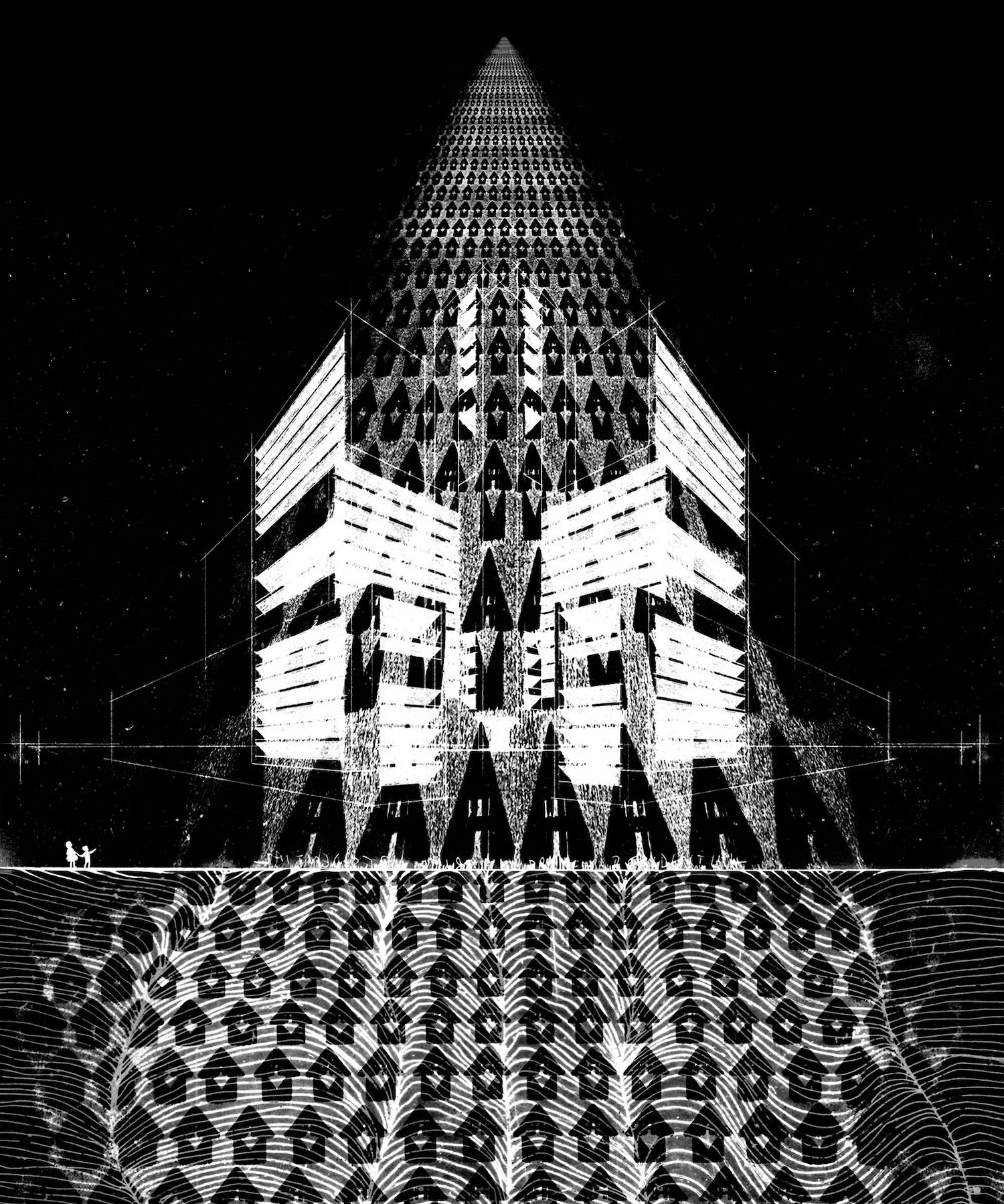
ELISABETTA P. — Both by observing your artworks and by reading your texts, I have noticed that you have drawn upon mythology and symbology to then form a peculiar symbolic repertoire which has become one of your distinguishing stylistic features. Can you explain, for example, what fascinates you about the figure of the minotaur and the theme of the labyrinth?
STANLEY D. — I started trying to make a film about London as an imaginary prison; or rather, as a prison of the mind. This was a long time ago, now, and unfortunately the footage has been lost. I was filming in the older parts of the city, where much of the Mediaeval street pattern survives but has been transformed by modern architecture into dark canyons walled with concrete and glass. My wanderings were directed by a hopelessly out-of-date guidebook published in 1911 and a peculiar book about prehistoric London published by an order of druids at around the same time. I spent a long time on this project, and when I look back on that time, I think I might have been a bit mad.
I also joined the National Trust (which was rather out of character) so I could visit various mazes in the gardens of stately homes. Mazes are very different to labyrinths; mazes can contain dead-ends and multiple routes, whilst labyrinths are unidirectional, and inevitably lead to celebrant to the centre. The minotaur is, of course, the mythical inhabitant of the labyrinth at Knossos in Crete; I even went to Crete to investigate the site. A strange island; despite the bright sunshine it’s sort of eerie. I wanted to walk out into the interior of the island on a dusty road until I collapsed.
ELISABETTA P. — The minotaur is notably considered as a monstrous and terrifying character, although you’ve come to represent it as a tiny weeping figure. What meaning does it have to you?
STANLEY D. — I imagined that the half-bull, half-human baby born of the union of Queen Pasiphae and a bull would not have had a happy childhood. Rejected by humanity, expelled to the dark stone womb of the subterranean labyrinth beneath the palace, fed once every seven years on human flesh – the creature will not – cannot – be anything other than a monster. But the true monsters of Earth are us, the human race. We are the ones who build a labyrinth around ourselves, and we are the monsters who roam its passages. The minotaur weeps for itself, but also for us.
ELISABETTA P. — What other symbolism normally recurs throughout your work?
STANLEY D. — I’m not sure; I don’t consciously choose to use symbols. That probably sounds ludicrous… I suppose I think of them as icons rather than symbols; elements that are open to interpretation, rather than having a fixed meaning. I’ve used that bear-creature with the pointy teeth a lot; that began as a picture to illustrate a story I was telling my daughter one winter morning long ago. I like the sorts of icon/symbol/image that people can copy easily, to doodle on a school text book or spray on a wall. A number of people have had tattoos of these things done, which is either a terrific compliment or a bit weird. Or both.
ELISABETTA P. — Nature seems to have a relevant presence in your paintings, drawings and prints, although it often appears to have a conflictual relationship with the human environment. It is never benevolent or reassuring but rather threatening and eerie. What’s your relationship with it and the way you choose to represent it?
STANLEY D. — I think perhaps I have an overactive imagination. The idea of a solitary walk in a forest is very appealing in theory, but whenever I try it I get very jumpy. The last time I went out for a lonely walk for a few days in woods and forests everything went wrong quite quickly. I got lost and drunk, or drunk then lost, or something. It all went a bit Blair Witch Project when it got dark.
I think the idea of nature as ‘picturesque’ or ‘pretty’ is extremely recent in human history; really, this concept doesn’t date back much further than the 18th century in the West. For most of humanity’s existence nature has been a source of threat, whether real or imagined, actual or spiritual. I’m as appreciative of the natural world as I could be, but I don’t see it merely as an attractive backdrop.
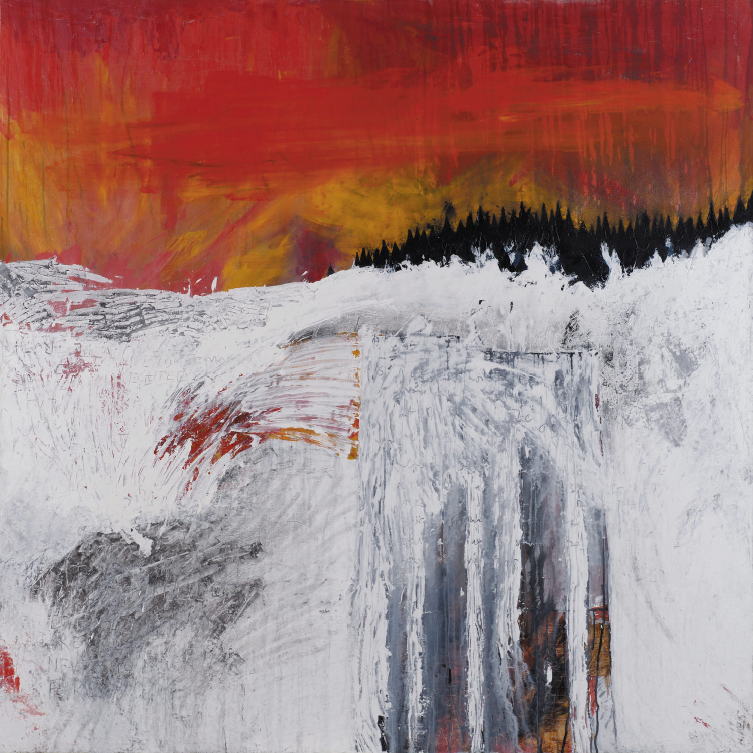
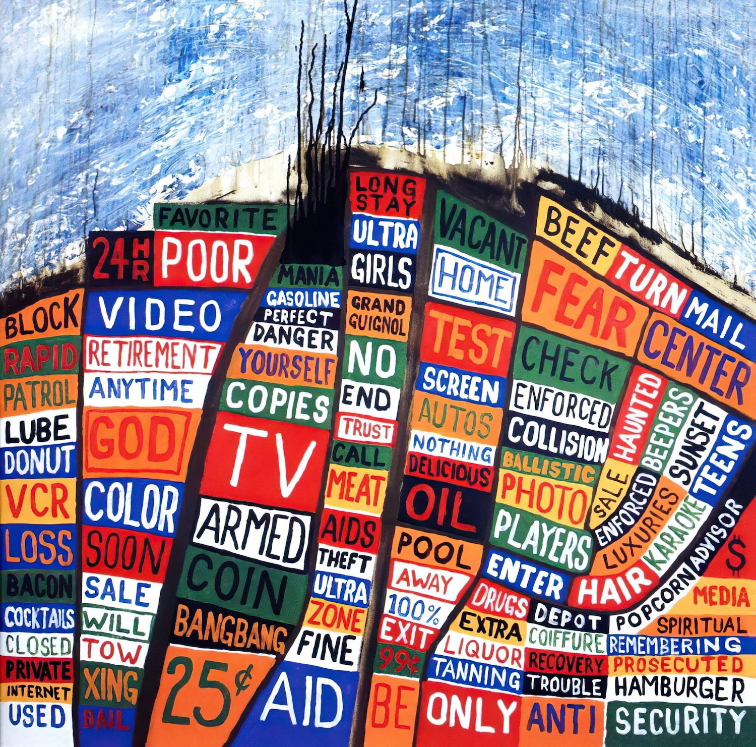
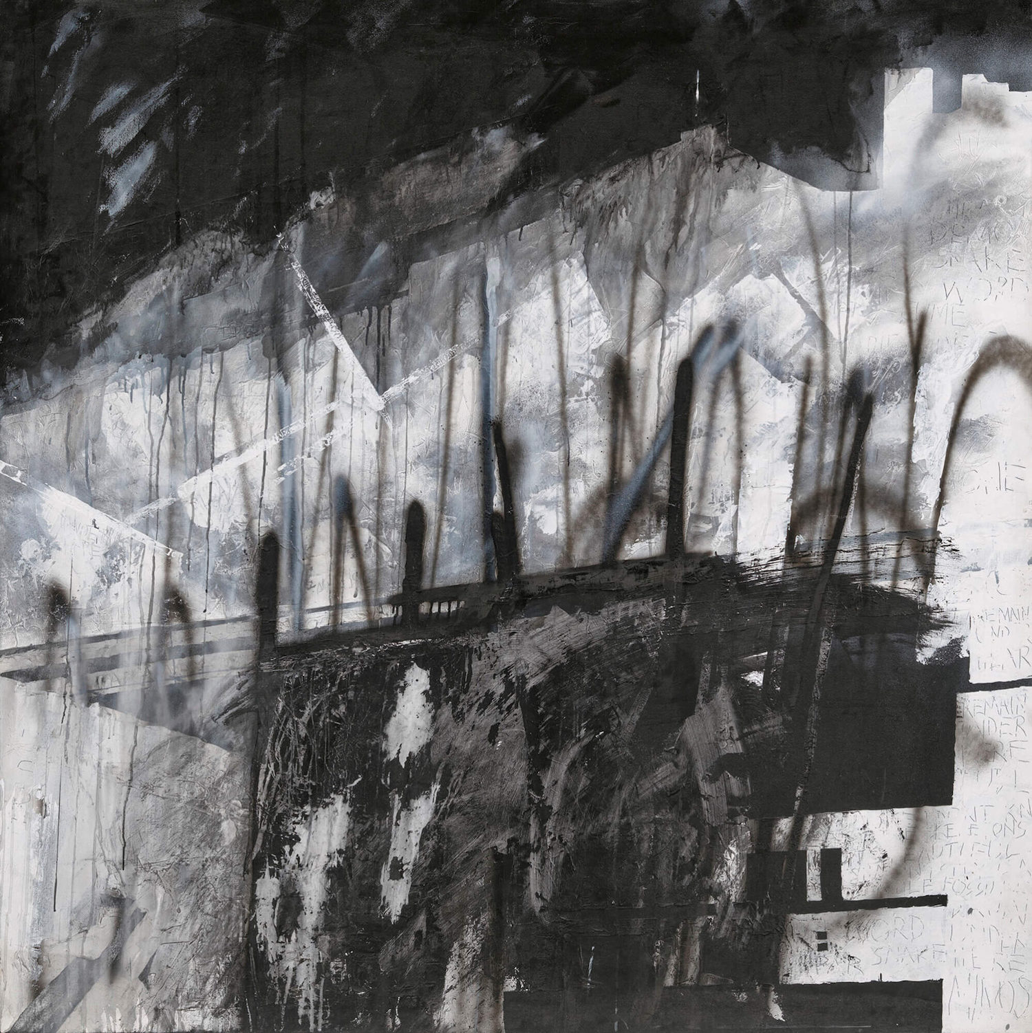
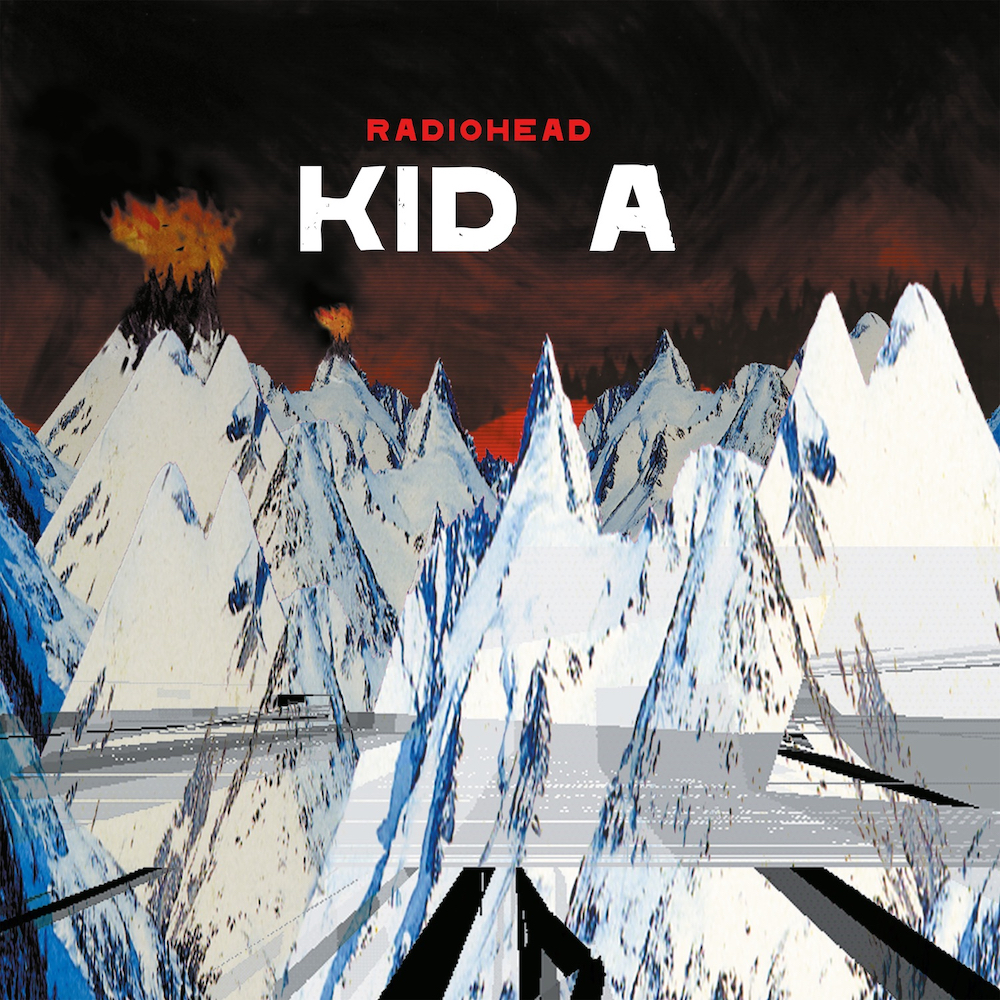
ELISABETTA P. — When approaching your works, particularly your paintings – where primary and vibrant colours get muddy and deadened by black brushstrokes and where the canvas’ surface is scratched with edgy and stylised figures – we feel like the spectators of some post-apocalyptic scenario. We’re thinking particularly at the ominous landscape series you made for Radiohead’s ‘Kid A’ record sleeve. What’s the thinking and concept behind such a painting style and subject?
STANLEY D. — The work for ‘Kid A’ was a series of large (6′ x 6′) canvases, painted using knives and sticks, with paint, mud, gravel, soot, artex and charcoal. The inspiration for them was, loosely speaking, the war in the former Yugoslavia. I had seen a very distressing photograph of a patch of snow marred with boot-marks, engine oil, cigarette butts and blood. That is where that series of works began. I wanted to use the idea of snow – often described as ‘virginal’ or ‘a blanket’ – becoming the canvas for all sorts of distant atrocities. During the painting of those pictures – I think there were five or six of them – I descended into quite a strange world.
ELISABETTA P. — Are there any artists you have mainly been drawing your inspiration from?
STANLEY D. — Too many to mention! And not just artists, it’s writers too, and textbooks, and advertising, and, well, everything.
ELISABETTA P. — Apart from that, what dictates your drive to make art? Is there anything else in your environment which inspires your production?
STANLEY D. — Not really. To be honest, I try not to investigate this too deeply, for fear that by understanding my motives I might kill them, or injure them at least…
ELISABETTA P. — You make consistent use of traditional printing and etching techniques, such as lino print and Risograph printing. What brought you to approach these media? What can you achieve with them?
STANLEY D. — I became extremely bored with digital ways of working. My life seemed to be reducing itself to a series of mouse-clicks, trackpad swipes and button-pressing. More worryingly, as memory became cheaper to buy, my own organic memory seemed to be shutting down. First it was phone numbers, then the forgetfulness started to seep into operational areas; I could remember how to do something whilst sitting in front of a computer, but I couldn’t explain how the action was carried out if I was asked. I began to wake up in what I can only describe as a computer-like way, and I started to read out loud what I was doing on a computer; ‘file, save as, quit, shut down’. It was a bit worrying. So, I started to paint again, I started to draw, and I started to find out how to actually DO things.
ELISABETTA P. — Ok, you get probably asked about Radiohead all the time, still do you mind telling us about the creative process behind every album’s artwork? Are you particularly attached to any of those in particular?
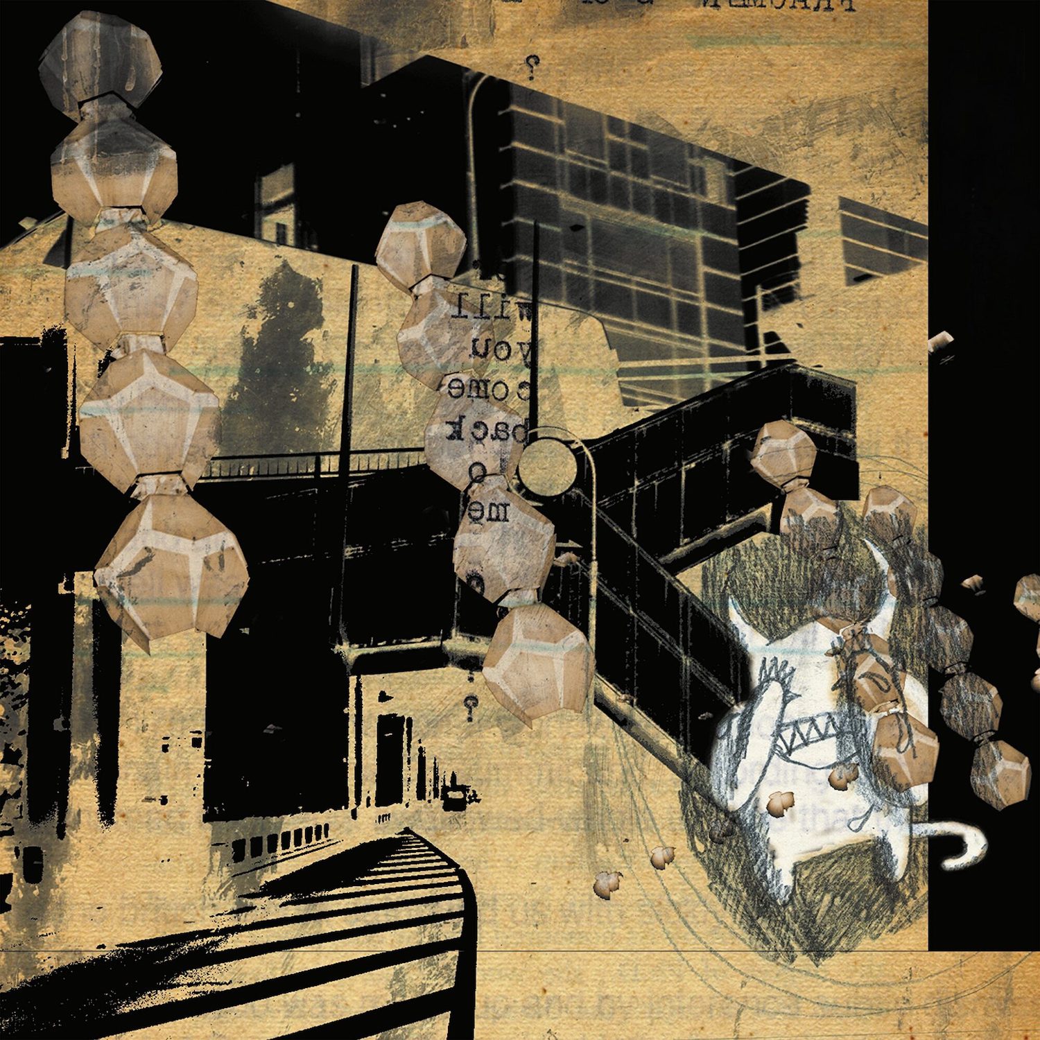
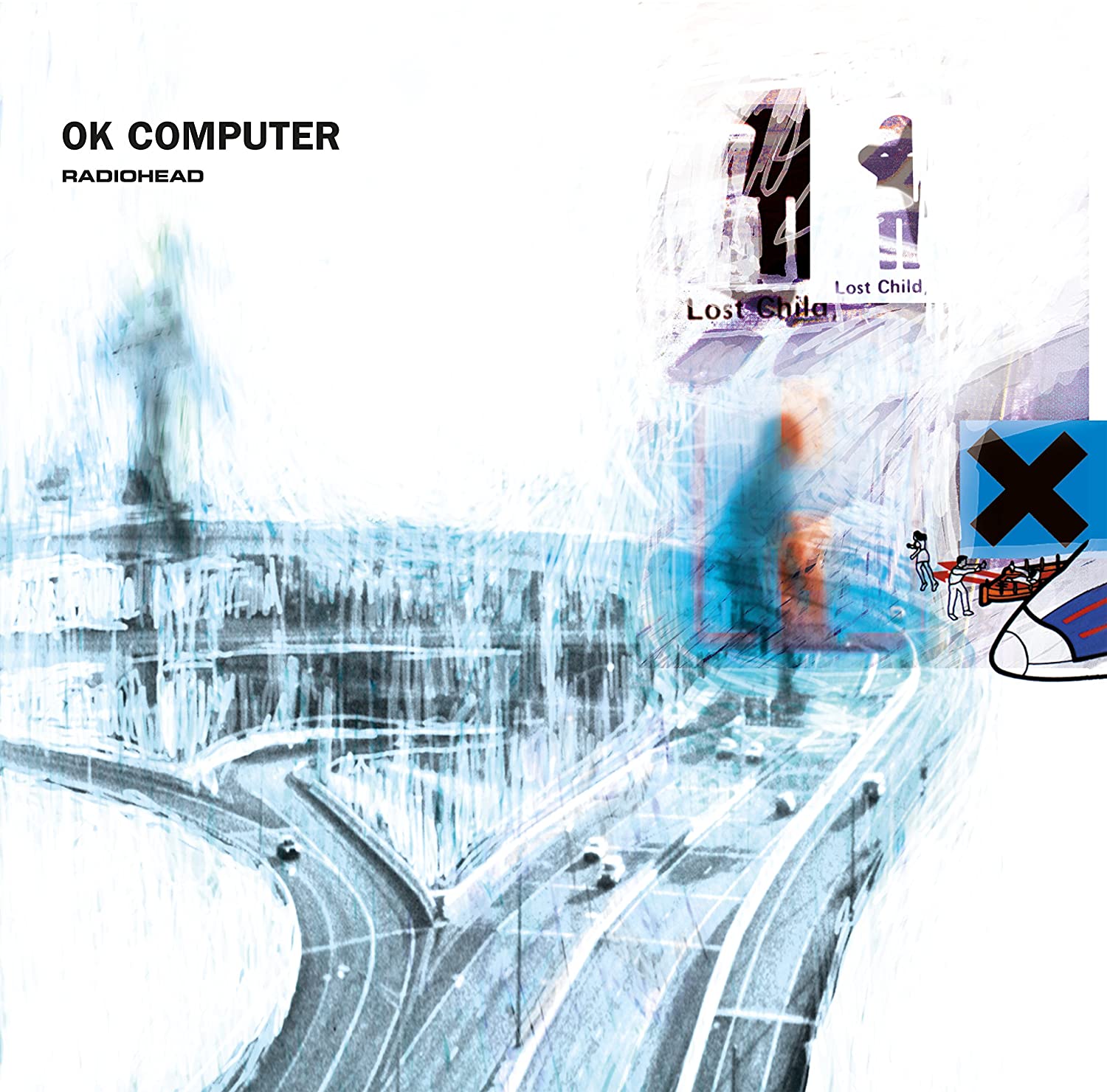
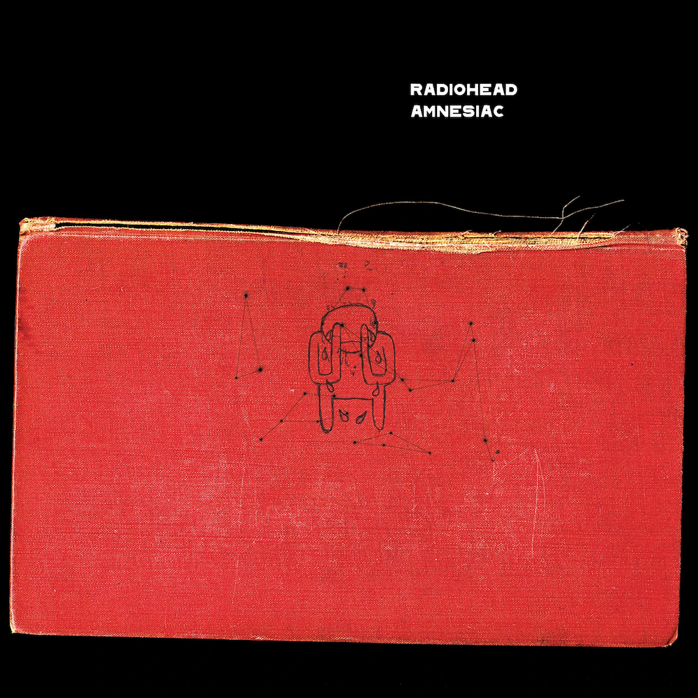
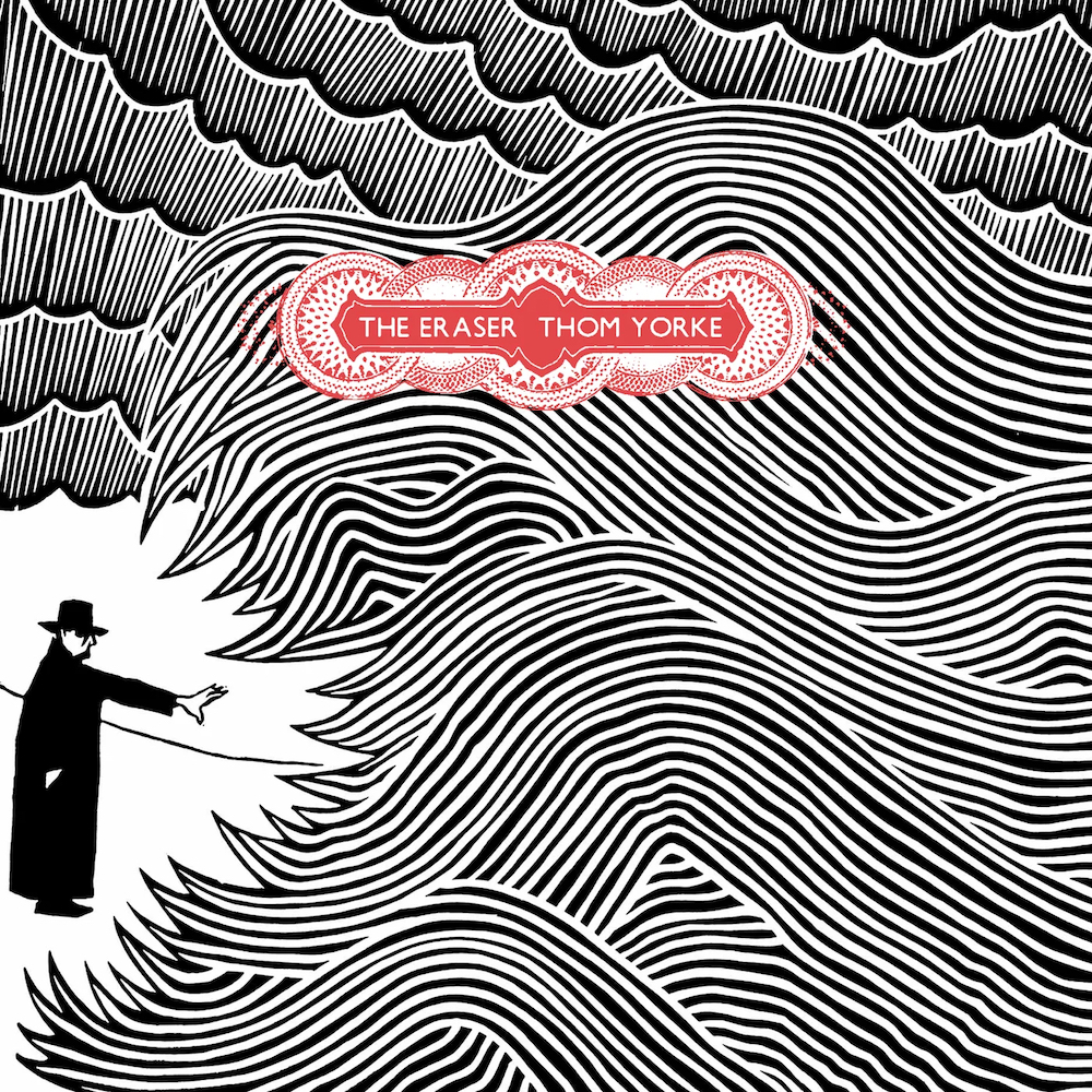
STANLEY D. — Well, very briefly, and from a practical point of view, ‘The Bends’ was made using a VHS video camera, them photographing the results from a TV, then scanning the photographs. ‘Ok Computer’ was done by scanning loads of detritus, old textbooks and using a tablet and a light-pen, and not using the undo function ever. ‘Kid A’ was done by taking large paintings as a starting point, then using a program called Lightwave. ‘Amnesiac’ was mostly from sketchbooks, maps and photographs taken in Tokyo, ‘Hail to the Thief’ was large paintings again, ‘In Rainbows’ was done using hypodermic syringes, ink and molten wax, and ‘The King of Limbs’ was a big mixture of lots of different techniques.
ELISABETTA P. — Frontman Thom Yorke is renown to be the most active, among the band’s members, concerning the ideas input behind the artworks you produce for them which, over time, have come to delineate a very distinctive visual identity for Radiohead. Would you say there is some visual and ideological bound between the two of you?
STANLEY D. — Yes, I think I would.
ELISABETTA P. – What’s the story behind the Radiohead Bear ‘logo’?
STANLEY D. — As I mentioned earlier, it began as a quick drawing to illustrate a story I was telling my very small daughter when I was half asleep about how adults stop playing with their toys, and the toys end up being left in the attic where they slowly get angrier and angrier before coming down the stairs to eat the now-adult children who abandoned them.
ELISABETTA P. — Have you ever considered quitting painting for writing?
STANLEY D. — No, but I have found that I can’t do both at the same time.
ELISABETTA P. — What are you currently working on?
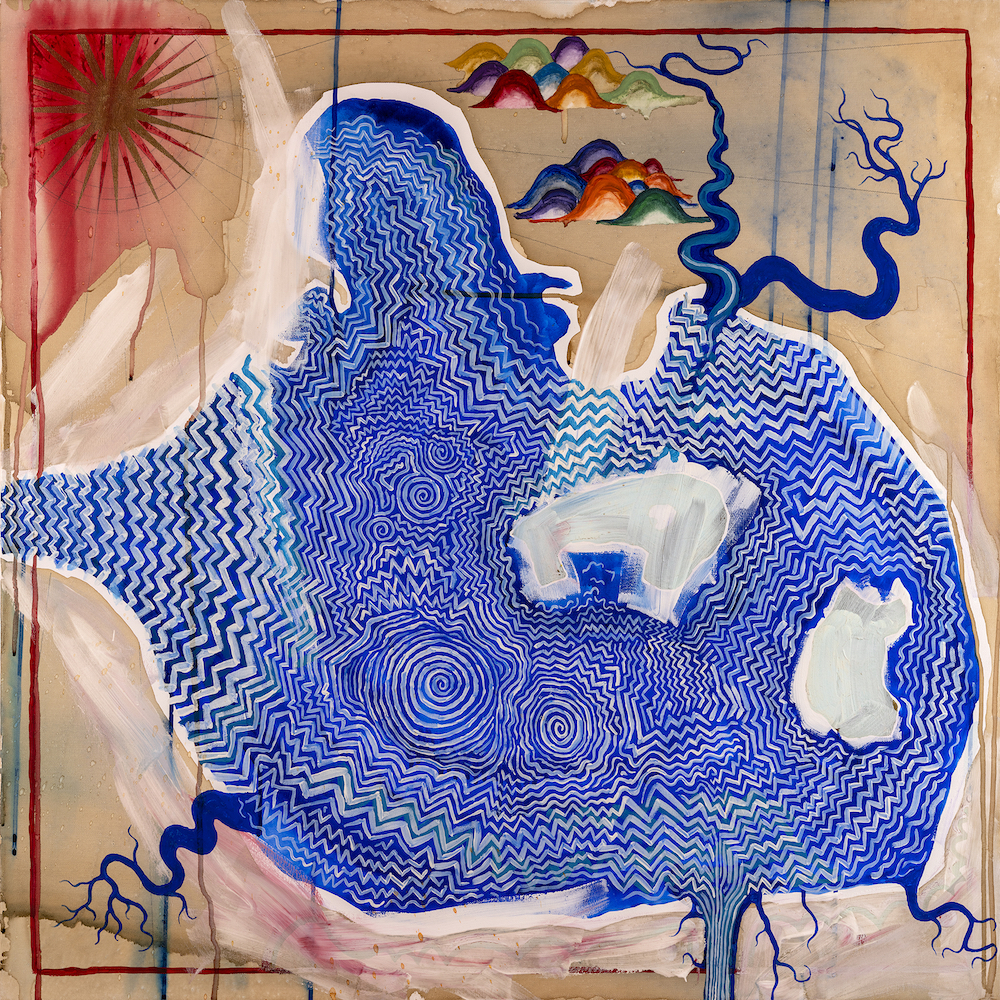
STANLEY D. — I’m working on a few things concurrently; one is a series of paintings that I’m calling ‘Sacred Landscapes’, which are large, brightly coloured renditions of a combined cartographic and topological view of the lands centred on sites of mystery in the islands of Britain – chalk figures carved into hillsides, prehistoric stone monuments, places like that. I start with large-scale maps and transcribe the field patterns, then paint in the fields, and have carefully applied drips running upwards into a black sky.
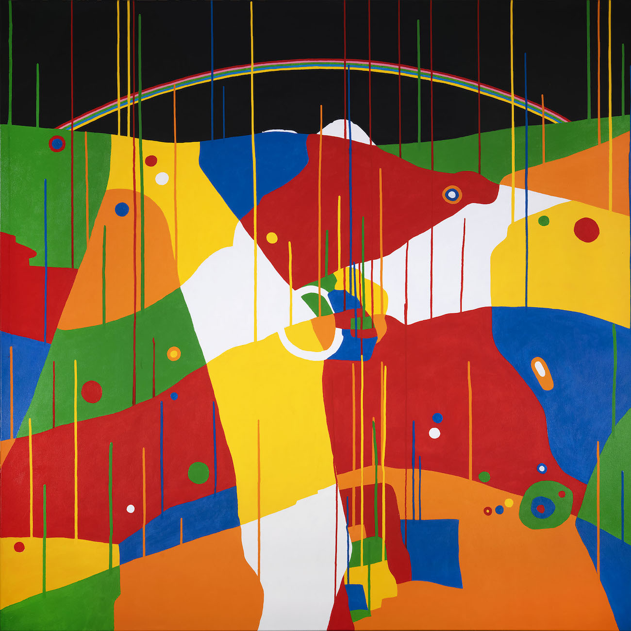
Another project is a series of paintings, the first few of which form the artwork for Thom Yorke’s new project, ‘The Smile.’ We’ve been painting these together, and they’re loosely inspired by the maps produced by a mediaeval Arabic pirate. We hope to exhibit this series of paintings some time relatively soon, but I don’t know where or when, or indeed how. And as far as I can remember, the last project is a series of drawings which are a sort of spare time activity. These are essentially drawings of paths that disappear. I’m probably doing some other things but I’ve temporarily absented them from my mind.
slowlydownward.com
instagram.com/stanleydonwood
June 2023